
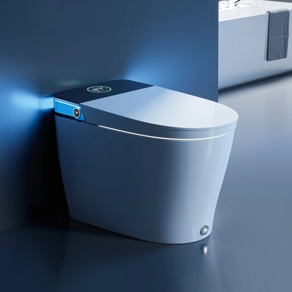
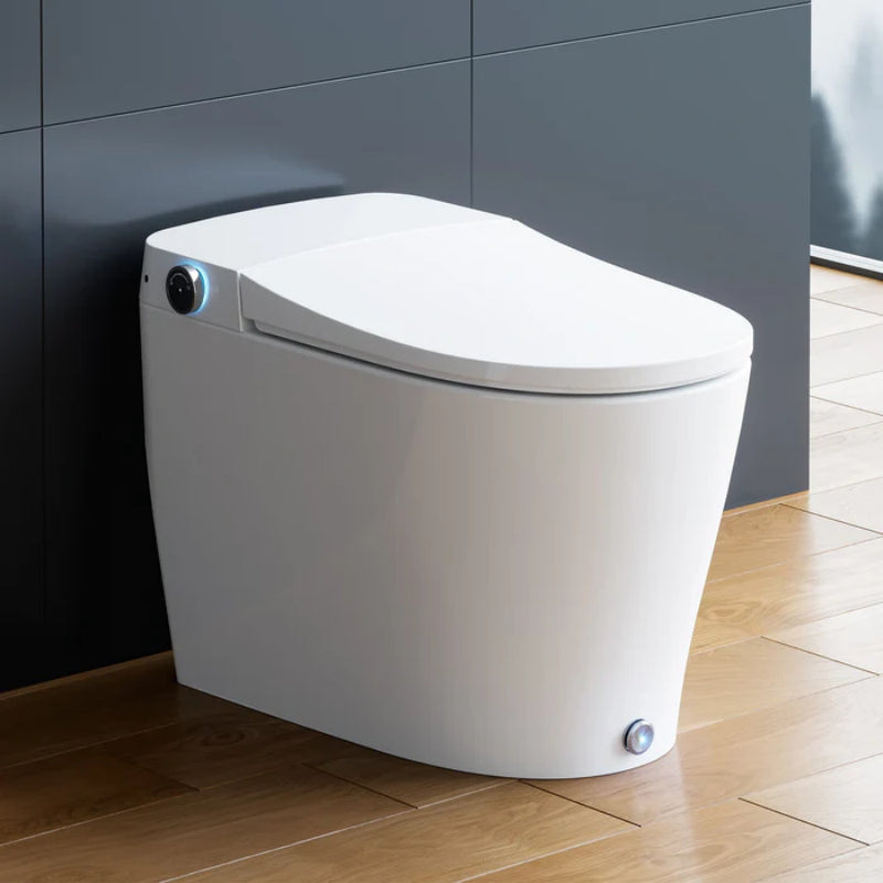
Toilet colors are no longer a one-option “builder white” decision. As we move through 2025 and into 2026, bathroom design is leaning into warm neutrals, earthy tones, soft pastels, and nature-inspired greens and blues. That shift changes how a toilet looks in the room—especially next to stone, wood, brass, and warmer paint shades. But a toilet is a long-life fixture, so toilet color affects more than style. It also changes perceived cleanliness, what stains you notice first, how hard water marks show up, and how easy it is to replace parts later. This guide starts with quick “best choice” answers, then walks through trends, practical pros and cons, and a step-by-step way to choose.
Best toilet color right now
Choosing the right toilet color depends on your priorities—resale value, style, or ease of maintenance. Here’s a quick guide to help you decide.
If you want the safest, most resale-friendly choice: white (and why it still dominates)
If you want the lowest-risk answer to “What is the best color for a toilet?” the answer is still white.
The main reason is simple: white toilets are the easiest to buy, the easiest to match, and the easiest to replace. If a tank lid breaks, a seat cracks, or you remodel again in five years, white keeps your options wide. It also reads as “clean” to most people at a glance, which matters in small bathroom spaces and in homes that may be sold or rented.
Is white boring? It can be—until you realize the toilet does not need to be the star. Many of the most current bathrooms in 2025 and 2026 use bold tile, cozy wallpaper, warm metals, or wood accents, and they keep the toilet neutral so the room feels calm.
Estimated catalog share (not a sales statistic): Many fixture catalogs still show a heavy majority of white SKUs compared to different coloured toilets. The chart below is a rough estimate based on typical product range patterns, not a verified market report.
| Color group | Estimated share of commonly listed toilet SKUs |
| White / bright white | 80–90% |
| Off-white / biscuit / almond / beige | 8–15% |
| Grey / black / other colors (green, blue, pink, etc.) | 2–7% |
If you’re asking “What is the most popular color toilet?” it’s still white, by a wide margin.
If your bathroom uses warm neutrals: choose warm white/ivory or biscuit/almond
A bright, blue-leaning white toilet can look a bit “icy” next to warm tile, tan stone, rustic wood, or creamy paint. That’s why warm whites and off-whites are growing in popularity.
If your bathroom has beige, greige, tan, or wood or stone finishes, a cream color toilet, off-white toilet, or beige colored toilets (often called biscuit, almond, bone, or ivory) can feel softer and more cohesive. The key point is undertone. Some off-whites lean yellow, some pink, some gray. A mismatch can look “dirty” even when it’s clean.
If you’ve ever held two “white” shirts side by side and noticed one looks blue and one looks cream, you already understand this problem. Toilets have the same issue, just in ceramic.
Lighting swatch idea (what to test at home):
Try viewing your tile or paint sample next to a white sheet of paper and then next to a cream sheet. If the room suddenly looks warmer, a warm white or biscuit toilet will usually fit better than a bright white.
If you want a trend-forward look without high risk: sand/stone/greige toilets
Want something that feels current in 2026, but you’re not ready for a pink toilet? Stone-like neutrals are the sweet spot.
A sand, stone, or greige toilet works well in contemporary spaces that use earthy tones, minimalist lines, wood accents, and warm metallic details like brass. It helps the toilet “recede” instead of popping out as a bright white object.
This approach is also friendly to the popular spa aesthetic: soft surfaces, gentle contrast, and a calm palette. If you’re trying to make a small room feel cozy rather than stark, these mid-neutrals can help.
The guardrail is availability. These colors can be harder to find quickly, and matching later can be tricky. If you’re planning a bathroom in stages, keep that in mind.
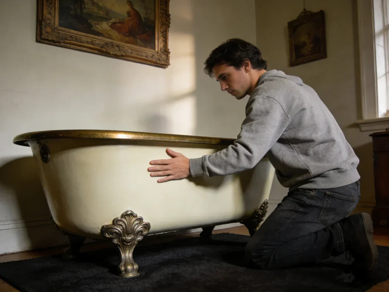
If you’re designing a statement powder room: consider black, green, blue, or pink (with guardrails)
A powder room is where people take design risks because the space is small and guests use it briefly. That’s why a black toilet, a hunter green toilet, a navy or slate toilet, or even a pink toilet shows up most often in powder rooms, not busy family baths.
Before you commit, use these guardrails (because a toilet is not like paint):
-
Hard water reality: Darker shades can show mineral spots as light marks, especially black and navy.
-
Cleaning tolerance: If you hate wiping things down, skip dark toilets and matte finishes.
-
Replacement planning: Save model numbers and finish names. Colored parts can be harder to match later.
-
Matching risk: If you also want a matching sink or tub, confirm availability before you start. A “close enough” mismatch can look accidental.
A bold toilet can look sleek, dramatic, and high-quality when done right. It can also feel like too much if your tile and wallpaper already have strong pattern and vibrancy. Ask yourself: do you want the toilet to be the accent, or do you want it to stay neutral while other elements like wallpaper and decor lead the room?
Toilet colors trends 2026 (what’s in, what’s fading)
Before diving into specific shades, it helps to look at the overall shift shaping bathroom color choices this year.
The macro shift: from pure white/cool gray to warm neutrals & earth tones
The big direction for bathroom color trends 2026 is warmth. Cool gray bathrooms, stark black-and-white fixtures, and harsh contrast are cooling off. People still like clean lines, but they want cozy, grounded color.
That’s why earthy tones keep showing up: clay, terracotta, sand, mushroom, warm beige, and soft browns. These shades work well with wood or stone, and they pair naturally with warm metals like brass. If your bathroom style leans modern but not cold, this palette makes it easier.
A practical side benefit is that mid-tone neutrals can hide tiny dust and daily marks better than pure white, while still looking “clean enough” to most eyes.
Nature-inspired greens and blues: spa palettes influencing fixture choices
Nature-inspired colors are pushing fixture decisions too, not just walls. A sage green bathroom with a wooden vanity and soft lighting is one of the most repeated looks in design media right now, and it flows into moss, olive, and even deeper forest greens.
Blues are also trending, from coastal soft blue to deep indigo and navy. These shades can feel calm, but they can also create dramatic contrast. A white toilet against navy tile can look crisp. A tonal navy toilet can look like a boutique hotel statement—if you’re prepared for the maintenance.
If you’re wondering, “Are colored toilets in style?” the honest answer is: they are more visible than they’ve been in years, especially in high-design spaces and retro renovations. But they are still not the mainstream default.
Soft pastels and “updated retro” (pink, baby blue, muted mint)
Pastels are back, but in a quieter way. Think dusty rose instead of hot pink, and muted mint instead of bright turquoise. When people use different colored toilets in this lane, they often keep the rest of the room modern: simple tile, clean lighting, and warm metal accents.
This is where “updated retro” works. A pastel toilet can look intentional when the room has sleek shapes and not too many competing patterns. If the room also has floral wallpaper, strong contrast, and lots of decor, the toilet color can tip from playful into chaotic.
What’s cooling off: stark monochrome, harsh contrasts, and cool gray bathrooms
Cool gray had a long run because it felt modern and safe. In many homes, it now reads a little flat. In the same way, harsh black-and-white schemes can feel strict in a room that people want to feel relaxing.
This matters for toilets because a bright white toilet can look like a spotlight in an earthy bath, and a black toilet can feel heavy in smaller bathrooms. It’s not that these choices are “wrong.” It’s that 2026 design is leaning toward softness, comfort, and natural tone.

Toilet colors (pros & cons) by color family
To make choosing easier, it helps to see how each color performs across cleaning, maintenance, resale, and availability.
Comparison table: stain visibility, cleaning effort, resale, availability, cost
This table is a practical way to compare colors of toilets. Ratings are general and assume typical glazed ceramic. Your water chemistry and lighting can change results.
| Color family | Perceived cleanliness | Limescale visibility (hard water) | Scratches/dust visibility | Resale comfort | Availability/lead time | Typical price tier |
| White / bright white | High | Medium (white scale blends) | Medium (hair/dust can show) | High | High | Low–mid |
| Warm white / ivory / cream | High | Medium | Medium | High | Medium–high | Mid |
| Beige / biscuit / almond / tan | Medium–high | Medium | Low–medium | Medium–high | Medium | Mid |
| Sand / stone / greige | Medium–high | Medium | Low–medium | Medium | Medium–low | Mid–high |
| Grey colour toilet / slate / charcoal | Medium | High (light scale stands out) | Medium | Medium | Low–medium | Mid–high |
| Black toilet / deep navy | Medium (depends on lighting) | High | High (dust, streaks) | Medium–low | Low | High |
| Green / blue / pink toilet | Medium (taste-based) | Medium–high | Medium | Low–medium | Low | High |
White vs off-white vs beige: the “neutral spectrum” and matching pitfalls
The neutral spectrum sounds easy until you’re standing in a bathroom with tile, paint, and a toilet that almost matches—but doesn’t. That “almost” can be the problem.
Undertones cause most clashes. A warm beige toilet can look great with creamy walls and brass, but it can look yellow next to cool marble-look tile. A warm white toilet can look soft with earthy tones, but it can look dingy next to a bright white sink.
If you want a simple rule: match the toilet to the warmest large surface you can’t easily change, like tile or stone. Paint can be adjusted later. Tile usually can’t.
Dark toilets (black/charcoal/navy): when they look luxe vs when they look high-maintenance
A dark toilet can look sleek, modern, and dramatic—especially with moody wallpaper, a minimalist cabinet, and metallic hardware. Done right, it can feel like a design moment.
But dark shades have a real-world tradeoff: they often show hard-water spots as chalky marks, and they can show dust and dried drips. If you have bright lighting or sunlight, streaks can be more obvious. If the bathroom is used by kids, you may notice splashes you never saw with white.
If you love the look, consider using a dark toilet in a lower-traffic powder room. If it’s your main family bathroom, ask yourself a blunt question: do you want dramatic contrast, or do you want your mornings to be easier?
Colored toilets (green/blue/pink): design payoff vs replacement anxiety
Colored toilets are having a moment again, but they still come with “future you” questions. If the toilet cracks, can you get the same color in five years? If you replace it with white later, will the room still make sense?
That’s why colored toilets work best when either you’re staying long term, or you’re designing the room so it can handle a change. One approach is to keep the rest of the room flexible: neutral tile, simple paint, and the toilet becomes the accent. Another approach is a fully coordinated set, where the toilet color is part of a whole palette.
And yes, there’s still a real community of people preserving vintage colors—avocado, pastel blue, and pink—because they like the character and don’t want to send a working fixture to a landfill.
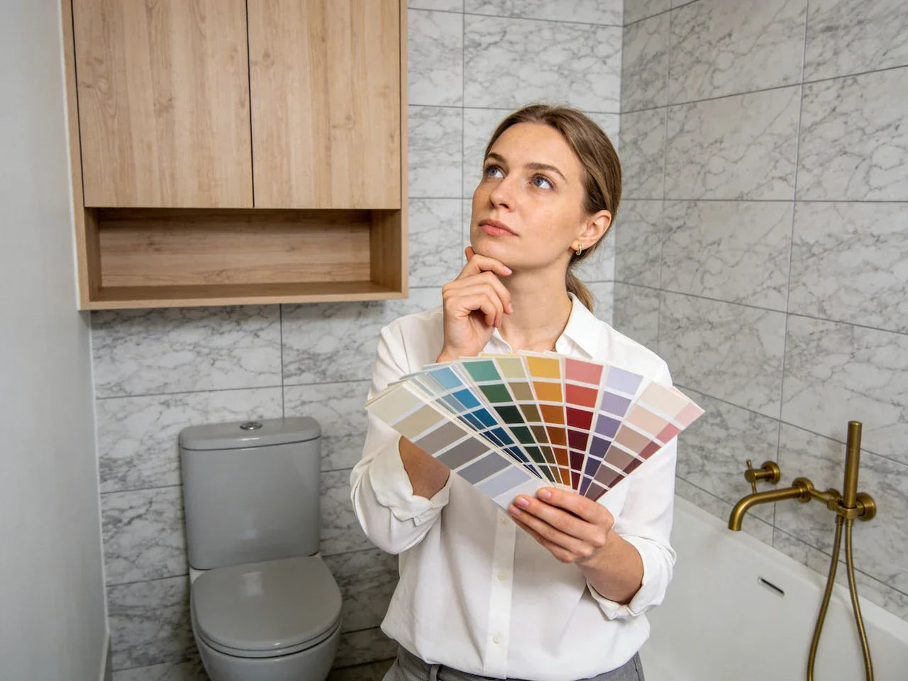
How to choose toilet colors for your bathroom (step-by-step framework)
It helps to break the decision into manageable factors—from your existing surfaces to light, space, and daily use—so you can pick a toilet color that truly fits your bathroom.
Step 1 — Identify your palette temperature (warm vs cool) and dominant surfaces
Start with what you already have: tile, vanity, countertop, and metal finish on your faucet. Is the room warm (beige, tan, cream, wood) or cool (gray, crisp white, blue-toned surfaces)?
Here’s a simple mini-quiz you can do in under a minute:
| Your bathroom leans… | You have mostly… | Safer toilet colors |
| Warm | beige/cream tile, wood vanity, brass | warm white, biscuit/almond, beige, sand/stone |
| Cool | gray tile, chrome, crisp white paint | white, cool white, light gray, slate |
| Dark & moody | navy, charcoal, black accents | white/warm white for contrast, or dark toilet if you accept upkeep |
| Light & airy | pale walls, light tile, small space | white or warm white to keep brightness |
If you can’t tell, look at your metals. Brass usually looks best with warm palettes. Chrome often reads cooler. Matte black can go either way, but it can push a room toward stronger contrast.
Step 2 — Account for lighting and room size (small bath rules)
Lighting changes color more than most people expect. A north-facing bathroom can make warm shades look dull and cool shades look harsher. Warm bulbs can make a bright white toilet look creamy. Daylight can make a beige toilet look lighter than you thought.
Room size matters too. In smaller bathrooms, lighter toilets keep the room from feeling crowded. Dark toilets can work, but they carry more visual weight, especially if the floor and walls are also dark.
If you’ve ever walked into a small bath and felt like the fixtures were “coming at you,” that’s usually contrast plus scale. A lighter toilet can calm that down.
Step 3 — Factor in water chemistry, cleaning habits, and household traffic
Hard water is one of the biggest hidden factors in toilet colors. If your water leaves white crust on faucets or shower heads, it will likely leave mineral marks in the toilet too. Those marks can show up differently by color.
If your house has hard water and you want a low-stress choice, white, warm white, and some beiges can be forgiving because scale is often light-colored. On a black toilet or a dark slate toilet, the same scale can show as bright spots.
Also think about traffic. A powder room used twice a day can handle a higher-maintenance color. A family bath used ten times a day may not.
Step 4 — Decide your “commitment level” (fixture permanence vs replaceable color)
A toilet is a permanent choice. Towels are not. If you love color but you’re nervous, go with a neutral toilet and add color in layers.
A low-risk plan that still looks current in 2026 is: neutral toilet + color in wallpaper, paint, art, a shelf with live plants, and soft textiles like yellow towels or yellow bathmats if you want brightness. If you want more contrast, swap the toilet seat color instead of swapping the whole toilet.
If you want to go the opposite route and make the toilet the statement, keep the rest of the room quieter so it feels intentional.

Matching toilet color to popular bathroom palettes (2026 examples)
Choosing the right toilet color might seem like a small detail, but it can subtly make or break the overall bathroom vibe. The goal is to either blend the fixture seamlessly into the palette or create a controlled contrast that feels intentional rather than jarring. Below, we explore some popular 2026 bathroom palettes and the toilet colors and finishes that best complement each style.
Earthy modern (clay/terracotta/sand): best toilet colors and metal finishes
Earthy modern bathrooms often use clay walls, terracotta accents, or sand tile, plus wood accents and warm metals. In these rooms, a bright white toilet can feel a bit sharp.
A warm white, cream, biscuit, or stone/greige toilet usually works well because it matches the softness of the palette. Pair this with gold or brass hardware if your tile is warm, and the room feels cohesive instead of high-contrast.
If you love contrast, you can still do it—just control it. For example, keep the toilet warm white, then add contrast through a darker cabinet or a patterned floor.
Green spa bathroom (sage/moss/olive): when to stay white vs go tonal
Green spa palettes are everywhere: sage walls, a wooden vanity, stone-look floors, and a calm mood. In these bathrooms, a white or warm white toilet is the most common choice because it keeps the room fresh and makes cleaning feel simpler.
A tonal green toilet can work, but it’s best when you can coordinate other ceramics too. If the sink and tub are white, and only the toilet is green, it can look like a mismatch unless the room is designed around that contrast.
If you want a safe middle ground, keep the toilet neutral and bring green in through plants, paint, and textiles. Even one shelf with live plants can help tie the whole palette together.
Deep blue/navy bath: balancing drama with perceived cleanliness
Deep blue and indigo bathrooms can look rich and calm at the same time. A white toilet here is an excellent choice because it gives the room crisp contrast and keeps the toilet feeling “clean” in low light.
A black or navy toilet can look striking, but it works best when you accept that water spots may show. If your water is hard, you may end up wiping it down more often than you expect. If you still want that look, a powder room is usually the easiest place to try it.
Soft pink/pastel bath: “updated vintage” without looking dated
Soft pink bathrooms can feel cozy and modern when the pink is muted and the rest of the choices are clean and simple. A white or cream toilet often looks best because it keeps the room from tipping into a full retro set unless you want that.
If you do want a pink toilet, keep the rest of the surfaces controlled. Simple tile, modern lighting, and warm metals help it feel intentional. Too many patterns can push it into a time-capsule look fast.
Finish & materials: gloss vs matte, ceramic vs seat color
Once you’ve settled on a color that complements your bathroom palette, the next step is thinking about how the toilet’s finish and material affect both style and practicality. Subtle choices—gloss versus matte, the exact shade of ceramic, or even the seat color—can change the room’s feel and make daily maintenance easier or harder.
Glossy vs matte toilet finishes: design impact and real cleaning implications
Finish matters as much as color. Most toilets are glossy because it’s easier to wipe clean. Matte finishes look modern and soft, but they may show marks differently depending on the glaze.
| Finish | How it looks | Cleaning feel | Best for |
| Gloss | Bright, reflective, classic | Usually easiest to wipe | Busy bathrooms, resale-focused homes |
| Matte/satin | Soft, modern, muted | Can show rub marks or streaks | Design-forward baths, lower-traffic rooms |
If you’re unsure, choose gloss. Many people pick matte because it looks calm online, then get annoyed when they notice streaks under bright bathroom lighting.
Undertones, sheen, and why “white” isn’t one color across brands
This surprises people: “white” is not a single universal shade across all toilets. Two whites can clash, especially if one is cool and one is warm, or if one is glossier than the other.
If you’re mixing fixtures, try to keep the main ceramic items in the same general white family. If your sink is a crisp white and your toilet is a warm cream, it can look like the toilet is old, even when it’s new.
Toilet seat color as a low-risk way to add contrast (wood, black, color)
If you want contrast without committing to a colored ceramic toilet, start with toilet seats. A black seat on a white toilet creates clean contrast and can tie into black hardware. A wood seat can warm up a bright white toilet and pair nicely with a wooden vanity or cabinet.
This is also a smart way to test bold ideas. Not sure if you’ll love a dark accent in the room? Try it with the seat first. It’s simpler to change than the whole toilet.
Durability notes: chips, scratches, and how color affects visibility over time
Chips happen. A small chip on a white toilet often blends in. On a dark or colored toilet, a chip can show as a bright spot if the base ceramic is lighter.
Scratches can also show more on matte finishes. If you have kids who might drop items, or if you’re outfitting a high-traffic bathroom, a classic glossy neutral can hide wear better over time.
Cleaning & maintenance by toilet color (hard-water reality check)
Color choices aren’t just about style—they also influence how stains, streaks, and mineral buildup show up over time. Understanding how different shades interact with hard water, rust, and daily wear can help you pick a toilet that stays looking fresh with minimal effort.

What stains show up on which colors (limescale, rust, organic rings)
Different stains show differently depending on toilet color. Here’s a practical visibility chart.
| Stain type | White / warm white | Beige / greige | Gray / black |
| Limescale (mineral buildup) | Low–medium | Medium | High |
| Rust stains | High | Medium–high | Medium |
| Organic ring/biofilm | Medium | Medium | Low–medium (but spots show) |
| Dust/hair | Medium | Low–medium | High |
If your home is on well water or you’ve seen orange staining before, white may show it faster. If your home has hard water scale, darker shades will show it faster.
Cleaner compatibility: bleach, acids, abrasives (and finish damage risks)
Most people reach for strong cleaners when they see staining, but harsh products can damage finishes over time. Abrasives can dull a glossy glaze. Some acidic cleaners can damage surfaces if used too often or left sitting. Bleach can be effective for disinfection, but it should be used carefully and never mixed with other cleaners. According to the CDC, household cleaners should always be used as directed on the label, and mixing products can create dangerous chemical reactions.
A simple, safer habit is to clean more often with gentler products, instead of waiting and then scrubbing hard. That matters even more for matte finishes and darker colors, where streaking can be easier to notice.
For disinfecting guidance and safer cleaning practices, use public health sources, and always follow the cleaner label.
Is a black toilet hard to keep clean?
It can be, depending on your water and your expectations.
A black toilet tends to show light-colored mineral spots, dust, and dried drips more clearly than white. If you live in a hard-water area, you may see spotting quickly. If you’re okay with a quick wipe-down and you like the dramatic contrast, it can still be worth it—especially in a powder room. If you want a “clean look” with low effort, black is usually not the easiest path.
Preventive routine that reduces staining regardless of toilet color
A simple routine helps every color, from bright white to slate:
| Task | Time | Why it helps |
| Quick brush/wipe of the bowl line | 30–60 seconds | Stops rings before they set |
| Dry wipe of drips on the outside | 20 seconds | Prevents spotting, especially on dark colors |
| Check for leaks (silent running) | 2 minutes weekly | Reduces mineral buildup and stains |
| Address hard water (if needed) | Varies | Helps prevent scale across the bathroom |
If your toilet runs silently, it can leave constant mineral traces. Fixing a small leak often makes the toilet look cleaner with less effort—any color.
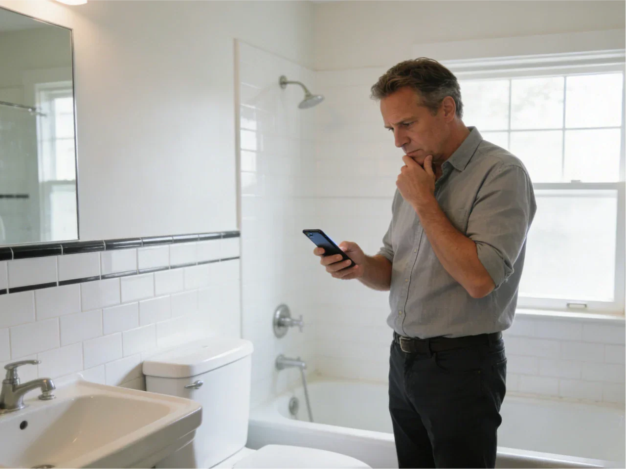
Cost, availability, and resale: what buyers don’t consider early enough
Color choice isn’t only about style—budget and lead time can quickly narrow the field.
Typical pricing tiers: white vs specialty colors (and why lead times vary)
In many markets, white toilets are produced in the largest volume, so they are priced more competitively and stocked more widely. Specialty toilet colors can cost more and may have longer lead times.
Here’s a relative view (not a store price list):
| Toilet color group | Relative cost | Typical availability |
| White | $ | In stock most often |
| Warm white / ivory / biscuit | $$ | Mixed (often available, sometimes ordered) |
| Greige / stone / slate | $$–$$$ | Often special order |
| Black / colored (green/blue/pink) | $$$ | More often special order |
If timing matters, confirm availability before you fall in love with a specific shade.
Replacement planning: matching a colored toilet 5 years later
Replacement is where many people regret bold choices. If you choose different coloured toilets, plan like a practical person, not just a designer.
Keep the model name/number and finish name. Save your receipt. If possible, buy an extra matching seat or key small parts at the start. If you may sell soon, consider staying in the neutral range.
Do colored toilets hurt resale value?
Sometimes, yes. It depends on how bold the choice is and how the rest of the bathroom is styled.
If you’re selling soon, neutral usually wins because buyers can imagine their own style. If you’re a long-term owner, you get more freedom. Also, a well-designed statement powder room can impress buyers, while a main bathroom with a very specific color scheme can be more polarizing.
A safe compromise is a neutral toilet plus a bold color scheme of maroon, navy, or hunter green on walls or tile. You can always go bold in paint and decor, then keep the toilet timeless.
Where to cite data: housing/remodeling surveys and market reports
If you want to go deeper on resale and buyer preference, look for large housing and remodeling reports, and consumer perception studies through academic sources. Those can help you judge how conservative or adventurous your buyer pool might be.
Real-world case studies: mainstream installs vs vintage revival
The best way to understand these choices is to look at how they play out in real bathrooms.
Case study: white toilet in a high-trend sage bathroom (why creators still choose white)
I helped a friend plan a sage green bathroom last year. They wanted warmth, softness, and a calm spa feel. We looked at green and beige toilets online, but we kept coming back to one concern: “What happens if we need to replace it fast?”
They chose a white toilet and used color in layers: sage walls, wood accents, warm metallic hardware, and a small plant shelf. The bathroom still felt on-trend, and the toilet didn’t pull focus. The room looked cohesive because the warmth came from the palette, not from forcing every fixture to match.
This is why white keeps showing up even when bathrooms are clearly not “builder white.” It’s neutral, it’s easy, and it doesn’t fight the rest of the aesthetic.
Case study: stone-colored toilet in an earthy minimalist bath (luxury integration)
In an earthy minimalist bathroom, a stone or greige toilet can make the whole room feel calmer. Instead of a bright object sitting in the corner, the toilet blends into the palette. With wood cabinetry, warm beige tile, and soft lighting, this choice can look high-end because it feels intentional and quiet.
The tradeoff is planning. These colors can be harder to source quickly, and you may want to confirm that matching parts are available before you install.
Case study: keeping a vintage pink/avocado/blue toilet and modernizing around it
Some homeowners inherit a vintage toilet and ask, “Why did they stop making colored toilets?” The short answer is demand and standardization. As bathrooms became more uniform in new construction, manufacturers focused on fewer colors to simplify production, stocking, and replacements. White also became strongly tied to the idea of hygiene and “clean.”
But keeping a vintage toilet can be a smart style move, not a mistake.
A friend of mine kept a pastel blue toilet in a small bathroom. Instead of matching everything to the blue, they went modern around it: simple neutral tile, updated lighting, and warm metals. The old fixture became the accent, not the whole theme. The room felt fresh, not dated.
If you like the character, you don’t have to rip it out. You just have to style it with restraint.

Are colored toilets coming back in style?
Yes, in a niche-but-growing way. You’ll see more colored toilets in design-focused homes, powder rooms, and retro renovations, and more warm neutrals like beige and greige in newer bathrooms. Still, white remains the default for most buyers because it’s easy, widely available, and resale-friendly.
Quick cheat sheet (pick your toilet color in one minute)
If you want a fast answer:
-
Choose white if you want the safest choice for resale, parts, and matching.
-
Choose warm white/cream if your tile and vanity are warm and bright white looks too sharp.
-
Choose beige/biscuit/almond if your palette is tan, rustic, or earthy and you want softness.
-
Choose stone/greige if you want a 2026 look that blends into wood or stone without going bold.
-
Choose a black toilet or bold color if it’s a statement room and you accept extra wipe-downs and future replacement planning.
FAQs
1. What is the best color for a toilet?
For most homes, white is still the best all-around choice. It’s easy to match with almost any tile, countertop, or wall color, and it never really goes out of style. White toilets are also the simplest to replace later because they’re widely available and consistent across different models. If your bathroom leans very warm in tone—such as beige tiles, wood cabinets, or creamy paint—a warm white or soft cream toilet can sometimes look more natural than a bright, cool white.
2. What is the most popular color toilet?
White remains the most popular toilet color by a huge margin. Walk into almost any store or browse most catalogs, and you’ll notice that white dominates the shelves. Builders, designers, and homeowners tend to choose it because it’s neutral, practical, and easy to coordinate with changing trends. Even in stylish or colorful bathrooms, white toilets are often used as a simple, reliable base that works with any design direction without drawing too much attention.
3. What color toilets are available?
Today you can find toilets in a wider range of colors than many people expect. The most common options are white and warm whites like ivory, biscuit, or almond. Beyond that, there are softer neutrals such as beige, sand, greige, stone, and gray. Darker choices like slate or black are also available. In smaller quantities, you can still find bold colors such as green, blue, or pink. However, these tend to be harder to source and are usually not stocked as regularly.
4. Are colored toilets in style?
Colored toilets are slowly making a comeback, but mostly in specific design situations. Warm neutrals like beige and greige are becoming more popular in modern, earthy bathrooms. Bold colors can look great in retro-inspired spaces or creative powder rooms. That said, they’re still considered a statement choice rather than a mainstream trend. White remains the safest and most timeless option, while colored toilets appeal more to homeowners who want a unique, personalized look.
5. Why did they stop making colored toilets?
Manufacturers never completely stopped making colored toilets, but they did scale them back over time. The main reason was simple demand. White toilets sold in much higher numbers and were easier to produce, stock, and replace. Builders preferred a single standard color, and homeowners found white easier to match during renovations. Over the years, white also became closely associated with cleanliness and simplicity, which made it the default choice for most bathrooms and new construction.
References

Leave a comment
This site is protected by hCaptcha and the hCaptcha Privacy Policy and Terms of Service apply.